Responsive Grid Layout with CSS
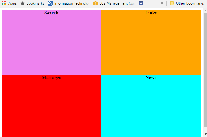
The colored rectangles are in a layout with 2 rows and 2 columns. If we want the columns to take the entire width of the container, we need to add a rule that there are 2 columns, each taking up "1 unit" (fr) of the width:
  .page-layout {
    display: grid;
    grid-template-columns: 1fr 1fr;
  }
The more challenging part is setting the height of each rectangle relative to it's width. Here, we are going to a common CSS pattern to set the height by adding a padding in units of %. This article on CSS tricks explains aspect ratio boxes . Since the text is at the top of each rectangle, we will add the padding to the bottom.
In the image, the aspect ratio (width / height) of the colored rectangles is 1.56. We want to set the height relative to the width as a percentage, which = (1 / 1.56)% = 63.8%. So here is the rule we need to add:
  .page-layout > div {
    padding-bottom: 63.8%;
  }
Element Re-ordering
In the HTML, the elements are in this order: News, Links, Search, Messages. We need to change the order to Search, Links, Messages, News. We can do this by adding an order rule to each of the divs:
  .news {
    background-color: cyan;
    order: 4;
  }
  .links {
    background-color: orange;
    order: 2;
  }
  .search {
    background-color: violet;
    order: 1;
  }
  .messages {
    background-color: red;
    order: 3;
  }