Problem Description
Code a web page, using flexbox, to look like this:
This is the footer
Copyright © 2017
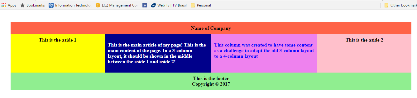
Code a web page, using flexbox, to look like this:
The layout has 3 rows: header, content (body) and footer. The content has 4 columns. To avoid CSS class name clashes, let's use the class names row1, row2, and row3, and name outmost div to container2.
  <div class="container2">
      <div class="row1">
        Name of Company
      </div>
      <div class="row2">
        <div class="col1">
          This is aside 1
        </div>
        <div class="col2">
          This is the main article of my page!  This is the main content of the page.  In
          a 3-column layout, it should be shown in the middle between aside 1 and aside2!
        </div>
        <div class="col3">
          This column was created to have some content as a challenge to adapt the old
          3-column layout to a 4-column layout
        </div>
        <div class="col4">
          This is the aside 2
        </div>
      </div>
      <div class="row3">
        <p>This is the footer</p>
        <p>Copyright © 2017</p>
      </div>
</div>The target image is a fixed .png file. Let us assume that the goal is to create a web page that is responsive to the size of the browser window. We will set the container to have display flex, and flex-wrap to wrap so all the rows are wrapped to individual flex lines, but set the max-width to be the same as the target image. Note: it would be equally valid to set on the container display block and remove flex-wrap, since this layout just requires that each row is a block that does not need to wrap.
The header, content and footer row are all 100% width. The header and footer only have only one or two lines of text. If there were more complex content in the header or footer, we might need to set these div's to also be flex, so we could add fancy styling rules like space-around or space-between.
The content (body) row has 4 elements, which we will make responsive by using display flex on the row, and inline-flex for each column. Examining the target image in a photo editor, shows that the columns have these widths: 300px, 340px, 340px, 300px. We will use the flex shorthand rule: flex: flex-grow flex-shrink flex-basis. We do not wish to distribute the extra space around the content, so flex-basis is 0. To maintain the proportions of the image, we will set flex-grow and flex-shrink for the 4 columns to be 3, 3.4, 3.4, 3.
Columns 1 and 4 have the text centered, and columns 2 and 3 have the text-align left. In the event that the text in columns 2 or 3 were less than a full line width, we need to specify justify-content: left so it is pulled all the way left to the padding.
The padding and font-size have been adjusted in an attempt to match the target image. The font-family was not adjusted, since this article from the American Writers & Artists Institute recommends san-serif fonts for legibility on computer screens. Combining all these features results in these CSS rules:
.container2 {
  display: flex;
  flex-wrap: wrap;
  text-align: center;
  padding: 40px 40px;
  font-size: 0.8em;
  max-width: 1280px;
}

.container2 .row1 {
  width: 100%;
  background-color: #FF4040;
  padding: 1em 1em;
}

.container2 .row2 {
  width: 100%;
  display: flex;
}

.container2 .row2 .col1 {
  display: inline-flex;
  flex: 3 3 0px;
  justify-content: center;
  background-color: yellow;
  padding: 1em 0.9em;
}

.container2 .row2 .col2 {
  display: inline-flex;
  flex: 3.4 3.4 0px;
  background-color: navy;
  color: white;
  text-align: left;
  justify-content: left;
  padding: 1.5em 0.9em;
}

.container2 .row2 .col3 {
  display: inline-flex;
  flex: 3.4 3.4 0px;
  background-color: violet;
  color: blue;
  text-align: left;
  justify-content: left;
  padding: 1.5em 0.9em;
}

.container2 .row2 .col4 {
  display: inline-flex;
  flex: 3 3 0px;
  justify-content: center;
  background-color: pink;
  padding: 1em 0.9em;
}

.container2 .row3 {
  background-color: lightgreen;
  width: 100%;
  padding: 0.5em 1em;
}

.container2 p {
  margin: 0 0;
}
Here is the alternative CSS where the container is not flex:
.container2 {
  display: block;
  text-align: center;
  padding: 40px 40px;
  font-size: 0.8em;
  max-width: 1280px;
}