Alitalia Airlines
The Wings of Italy
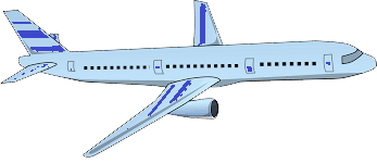
You will find, inside the homework6 folder, the necessary files to complete a very simple CSS3 animation. The plane.png does not have any background color (transparent background) exactly to look nicer on your animation.
You will include a h1 with the name of the company that should show up statically and centralized at the top of the page.
The main animation is to give the impression that the airplane is flying in the sky and that animation should give the following effect (the animation below is not showing the h1 neither the animation of the banner):
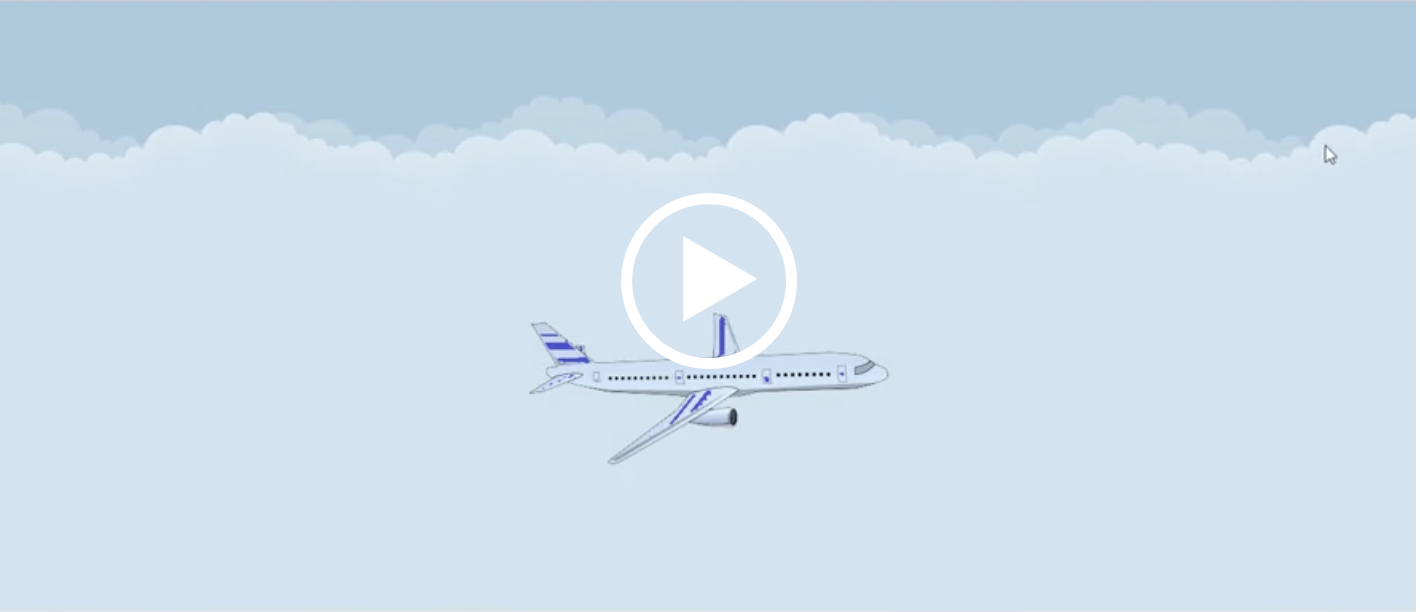
Besides the effect shown here of the airplane, you should also include a heading banner or a footer banner that will have the words FLY WITH US, WE ARE SAFE coming from the left side of the browser to the right side of the browser, then going back to the middle and stopping there at the middle (centralized within the width of the browser) - there should be, besides the moving from the left to the right, some type of rotation and resizing of the letters, etc. (be creative... but, at the end, the banner should stop horizontally in the middle of the line and it can be shown below or above the airplane - between the h1 and the airplane).
Another detail: the banner should NEVER have any of the letters "disappearing" from the browser window when moving from the left to the right (Tip: take a look at how to use calc(100% - WidthOfElement) to avoid that no matter the size of the screen)
EXTRA CREDIT for Part 1 - you will include a toggle button to have or not the animation and/or use the @media query for prefers-reduced-motion so the animation will not happen but the user would still see the h1, the image of the airplane having the sky as the background and you can also show the banner with FLY WITH US, WE ARE SAFE positioned in horizontally in the middle and can be placed below the airplane or between the h1 and the airplane.
Let's try to match the aspect ratio of the sample image. The height / width is about 43%, so we can first make a container element with a padding-bottom of 43%.
Next we will lay inside of this container, a series of <div>'s that are positioned absolute, with top and left both zero, and height and width 100%. That way we can layout the elements for sky, plane and banner in separate layers, and we can apply different effects for each layer.
The sky layer must be first, since we want this to be the bottom-most layer. Then we will add the header inside the sky element (so it is positioned statically). Next are the plane and the banner, and finally the button.
Since the CSS and JS is designed for this specific web page and not meant for re-use across pages, we will use ids on the elements. Here is the HTML.
  <div class="container-fluid hw6">
    <div id="animation-container">
      <div id="sky">
        <hgroup>
          <h1>Alitalia Airlines</h1>
          <h2>The Wings of Italy</h2>
        </hgroup>
      </div>
      <div id="plane-container">
        <img id="plane" src="images/plane.png" alt="airplane">
      </div>
      <button id="animation-button" class="btn btn-primary">Toggle Banner Animation</button>
      <footer id="banner">
        <div id="banner-message">
          FLY WITH US, WE ARE SAFE
        </div>
      </footer>
    </div>
  </div>
<script src="js/hw6part1.js"></script> First let's code the basic elements:
The #sky will be a flex element, so we can position the hgroup in the center and close to the top. We'll also make the #plane-container flex, so we can position the plane easily. If we really needed to put the #plane in the #sky element, we could calculate the height of #sky, since we know the aspect ratio, but it seems cleaner to just put the #plane in its own container. We'll also add a linear gradient for the background to the hgroup and the banner.
Since the CSS is in a separate file in the css directory, the directory for the url of the background image is not images but is ../images. This is because the url in a CSS file is relative to the location of the CSS file itself, unlike an img element in the HTML.
  #animation-container {
    position: relative;
    width: 100%;
    padding-bottom: 43%;
  }

  #sky {
    position: absolute;
    display: flex;
    justify-content: center;
    align-items: flex-start;
    top: 0;
    left: 0;
    width: 100%;
    height: 100%;
    background: url(../images/clouds.png) center top repeat-x;
    background-color:#C0DEED;
    animation: animatedBackground 30s linear infinite;
  }

  .hw6 hgroup {
    margin-top: 2em;
    display: block;
    padding: 0.5rem 1rem;
    color: #446b00;
    background: rgb(247,179,183);
    background: radial-gradient(circle,
      rgba(247,179,183,1) 0%,
      rgba(247,179,183,1) 77%,
      rgba(242,77,87,1) 100%);
    font-weight: bold;
    font-style: italic;
    border: 1px solid black;
    border-radius: 2em 2em;
    text-align: center;
  }

  .hw6 h1 {
    font-size: 1.4rem;
  }

  .hw6 h2 {
    font-size: 1.2rem;
  }

  #plane-container {
    position: absolute;
    display: flex;
    justify-content: space-around;
    align-items: center;
    top: 0;
    left: 0;
    width: 100%;
    height: 100%;
  }

  #plane {
    width: 25%;
    height: auto;
    margin-top: 5em;
  }

  #animation-button {
    position: absolute;
    top: 1em;
    right: 1em;
  }

  #banner {
    position: absolute;
    background-color: yellow;
    background: linear-gradient(90deg,
      rgba(255,248,0,1) 0%,
      rgba(255,182,5,1) 20%,
      rgba(255,161,113,1) 50%,
      rgba(255,182,5,1) 80%,
      rgba(255,248,0,1) 100%
    );
    border: 1px solid black;
    width: 20rem;
    height: 3rem;
    display: flex;
    align-content: center;
    justify-content: space-around;
    border-radius: 2em 2em;
    left: 0;
    bottom: 2em;
    animation: moveBanner 20s ease forwards;
  }

  #banner-message {
    display: flex;
    align-items: center;
    animation: message 20s linear infinite;
  }

  #animation-button {
    position: absolute;
    top: 1em;
    right: 1em;
} There are 2 parts to adding an animation to an element:
The animation properties are described on this page in CSS Tricks animation. To use the shorthand, list the properties in the order below.
| Property | Default | Description |
| animation-name | none | Declares the name of the @keyframes at-rule to manipulate. |
| animation-duration | 0s | The length of time it takes for an animation to complete one cycle. |
| animation-timing-function | ease | Establishes preset acceleration curves such as ease or linear. |
| animation-delay | 0s | The time between the element being loaded and the start of the animation sequence |
| animation-iteration-count | 1 | The number of times the animation should be performed. |
| animation-direction | normal | Sets the direction of the animation after the cycle. Its default resets on each cycle. |
| animation-fill-mode | none | Sets which values are applied before/after the animation. |
| animation-play-state | running | Pause/play the animation. |
Here are some of the keyword values:
animation-timing-function
animation-direction
animation-iteration-count
animation-fill-mode
animation-play-state
The @keyframes ruleset is described on this MDN page @keyframes. In animation, an image is given at specific points in time known as a keyframe. In between the keyframe, the image is interpolated by an "easing" function. The default is linear easing.
In CSS, the keyframes can be specified in 2 different ways.
Here is an example of an @keyframes ruleset:
  @keyframes slidein {
    from {
      transform: translateX(0%);
    }
    to {
      transform: translateX(100%);
    }
  }
Here is an example using percentages:
  @keyframes identifier {
    0% { top: 0; left: 0; }
    30% { top: 50px; }
    50%, 70% { left: 50px; }
    100% { top: 100px; left: 100%; }
}There are 3 animations we want to create:
The animation declarations are in the previous CSS, but they are repeated here for emphasis. Below each are the @keyframes.
  #sky {
    animation: animatedBackground 30s linear infinite;
  }
  @keyframes animatedBackground {
    from { background-position: 0 0; }
    to { background-position: 100% 0; }
  }

  #banner {
    animation: moveBanner 20s ease forwards;
  }
  @keyframes moveBanner {
    0% { left: 0; }
    50%   { left: calc(100% - 20rem); }
    100% { left: calc(50% - 10rem); }
  }

  #banner-message {
    animation: message 20s linear infinite;
  }
  @keyframes message {
    0% {
      font-size: 1em;
      transform: skewX(0deg);
    }
    50% {
      font-size: 1.4em;
      transform: skewX(-30deg);
    }
    100% {
      font-size: 1em;
      transform: skewX(0deg);
    }
} We will want some behavior to change based on media:
This article on CSS Tricks explains the rule for prevers-reduced-motion A Complete Guide to CSS Media Queries
  @media screen and (prefers-reduced-motion: reduce) {
    * {
      /* Very short durations means JavaScript that relies on events still works */
      animation-duration: 0.001ms !important;
      animation-iteration-count: 1 !important;
      transition-duration: 0.001ms !important;
    }
  }
  @media (max-width: 800px) {
    html {
      font-size: 12px;
    }
  }

  @media (max-width: 600px) {
    html {
      font-size: 10px;
    }
  }
If we didn't want to cancel all animations, we could unset the animations we do wish to stop:
  @media (prefers-reduced-motion) {
    #banner {
      animation: unset;
      left: calc(50% - 10rem);
    }
    #banner-message {
      animation: unset;
    }
} When the Toggle button is clicked, we will add or remove the class no-animation to the banner and banner-message. First, here is the CSS:
  #banner-message.no-animation {
    animation: unset;
  }

  #banner.no-animation {
    animation: unset;
    left: calc(50% - 10rem);
  }
Now here is the JavaScript:
  const animationButton = document.getElementById('animation-button');
  const banner = document.getElementById('banner');
  const bannerMessage = document.getElementById('banner-message');
  animationButton.addEventListener('click', function(evt) {
    if (banner.classList.contains('no-animation')) {
      banner.classList.remove('no-animation')
    } else{
      banner.classList.add('no-animation')
    }
    if (bannerMessage.classList.contains('no-animation')) {
      bannerMessage.classList.remove('no-animation')
    } else{
      bannerMessage.classList.add('no-animation')
    }
  });